
CASE STUDY
IBM Trade Assistant
MY ROLES
- UX Strategy
- Partner Relations
- Design Management
- User Research
- Art Direction
PROJECT INFO
This project and experience had every element you dream of as a designer. A useful and meaningful new experience for your users, a new partnership with an incredible brand and company, and an opportunity for collaboration within your team.
The IBM Trade Assistant product started with a simple idea and a funny name, but through teamwork, communication, and research, became one of the the best projects I've been a part of.

Background
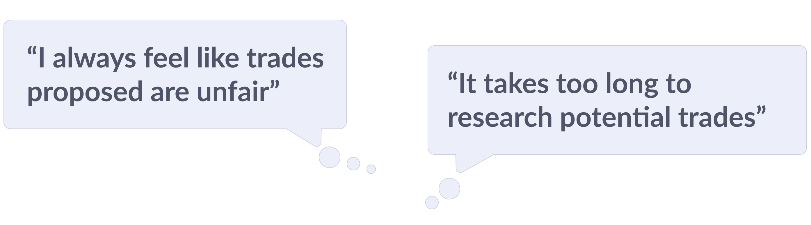
As a design lead on the Fantasy Sports team, I regularly used free time to explore aspirational improvements to our products, with no limitations on feasibility, budget, or technical constraints — informed by my own use of our products, user feedback, and analytics.
I regularly brought these ideas to our design team syncs, where we could workshop them together — getting feedback, brainstorming iterative improvements, and identifying which concepts that might be viable to share with product and leadership.
The Idea
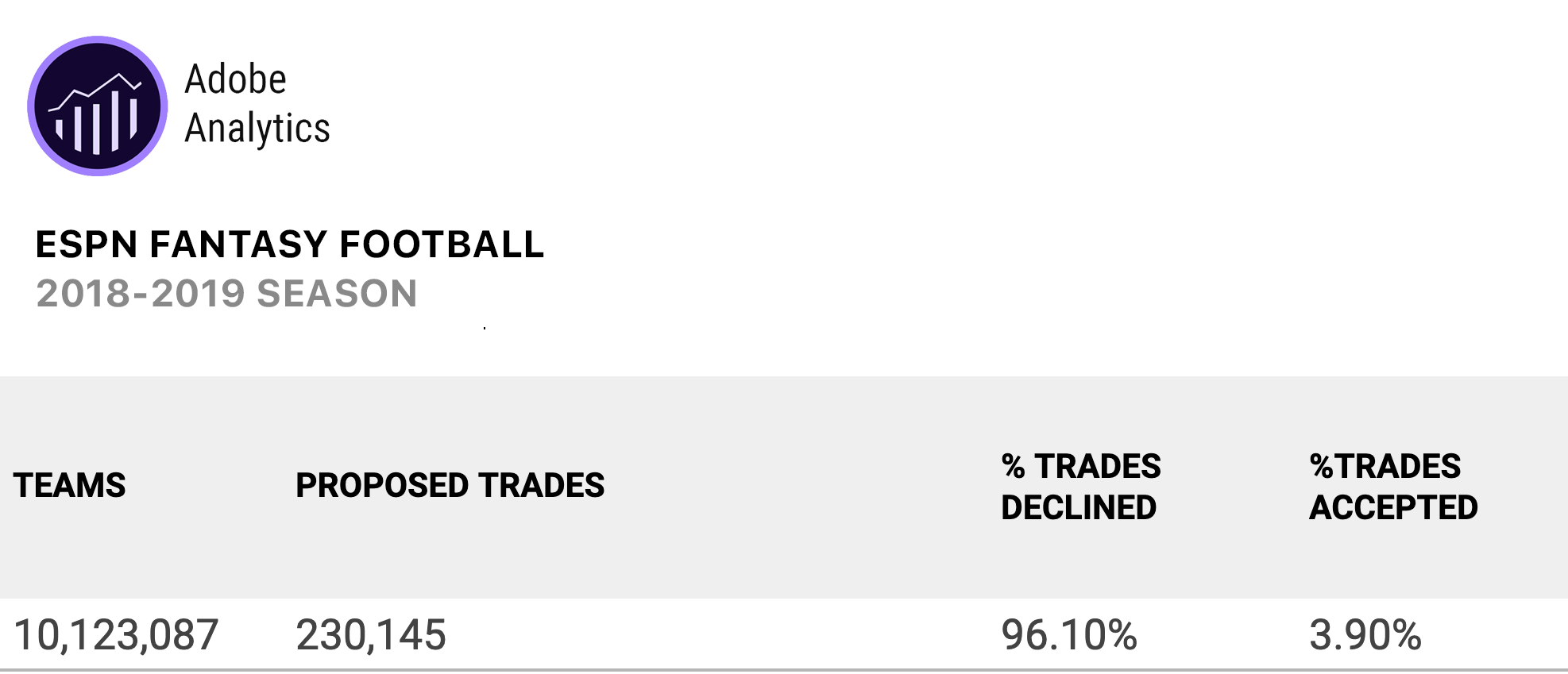
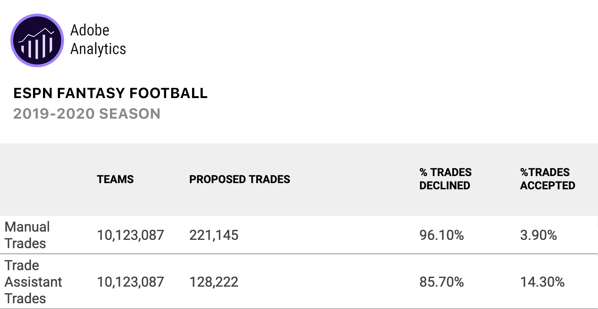
Based on user feedback and usage data, making a trade for a player with another team has always been met with hesitation in Fantasy Football leagues. Players often feel they will get the bad end of the trade and feel like they were “fleeced”. This is backed up by looking at analytics for our trade feature. Numbers for players proposing these trades were low, and the amount of trades that were accepted were miniscule.
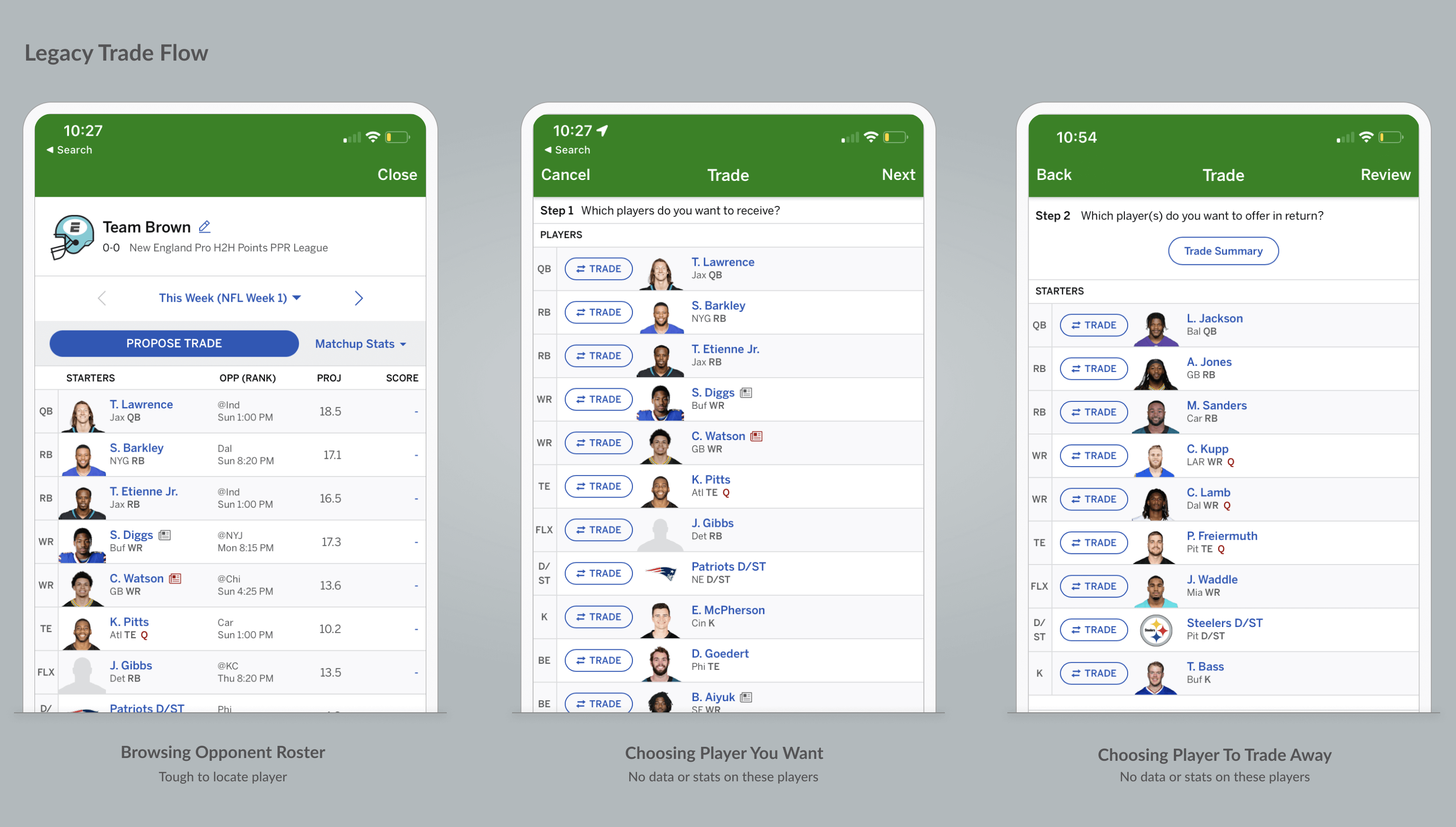
In reality, good trades are beneficial to both teams involved, filling needs and being able to get something in return for unneeded players. With trading being a key way that players can interact with each other, improve their teams with viable trades, and increase time spent on our platform, was there something we can build to encourage trading?
Through my design team's independent research and aspirational design time, we developed a concept to identify some smart trades for the player, backed up by data and fairness to the other team receiving the trade proposal.
The Initial Concept
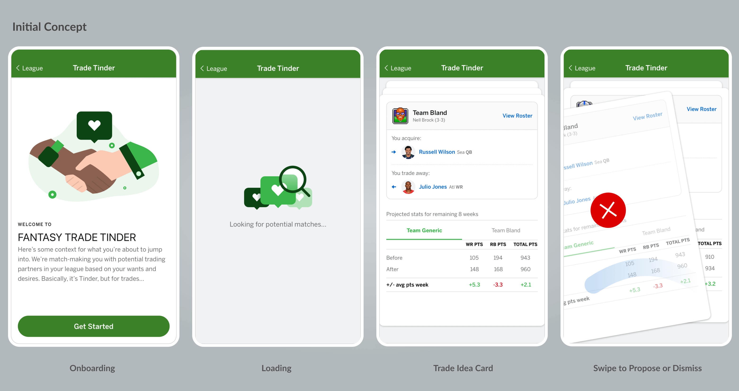
With this problem in mind, the team set out to put some concepts together for what could make trades more approachable, provide education, and adopt more usage. One part of this brainstorming was competitive analysis. At the time Tinder was popular, and we enjoyed the paradigm of suggestions in the form of cards you could accept or dismiss. We thought something like this could be a a light touch daily or weekly activity for the player, browsing some suggested trades that could help your team, and be fair to the other team.
Goals for the feature
- Fun
- Informative
- Fair
- Easy
- Optional
We shared the concept with the product team who enjoyed it, and helped us identify metrics which we could present with each trade, such as projected points for the upcoming week before and after a trade, and also projected outcomes for the remainder of the season. Although it didn’t fit in our current roadmap, we did some additional work to flesh out the flows, and where a feature like this could be presented on the app and web.
Journey Mapping
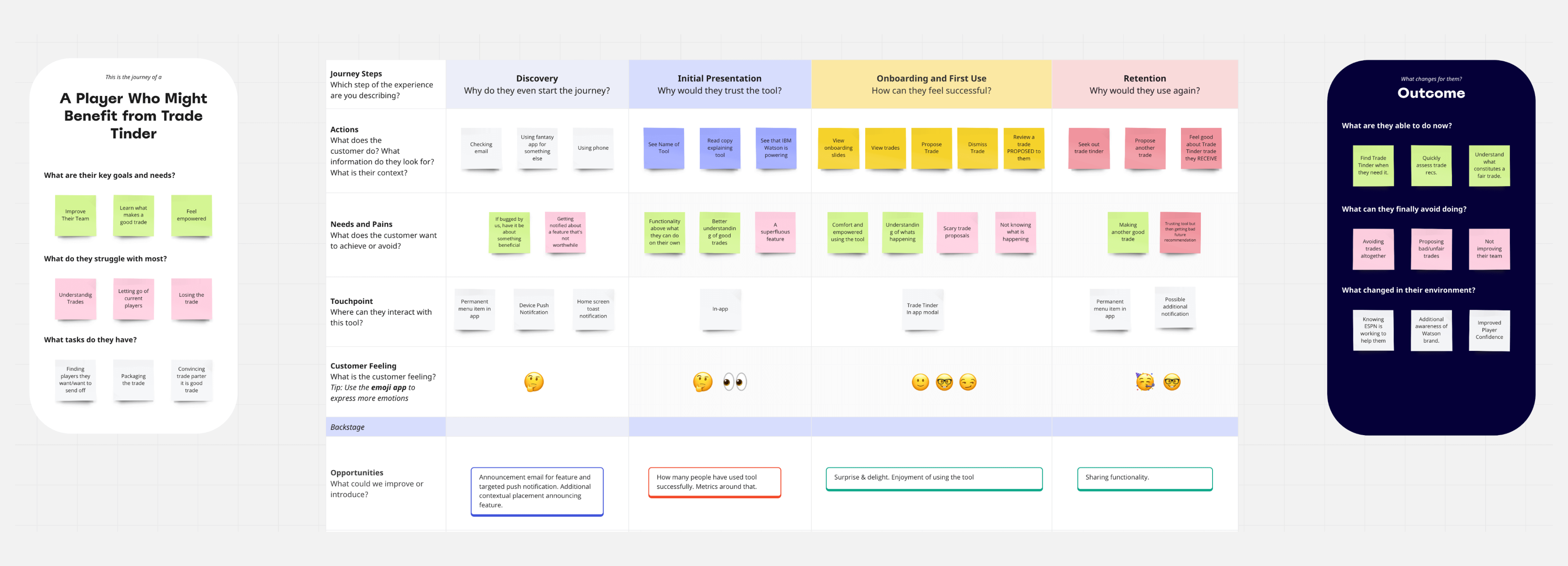
Although we started with some polished looking designs due to this being a fun exploration, it was important to do some mapping of what we wanted to accomplish with this feature. This included where the user could discover it, how we want them to feel using it, and the outcomes. Even if the design or UX ended up changing, these principles would help guide the solution.
Experience Flow
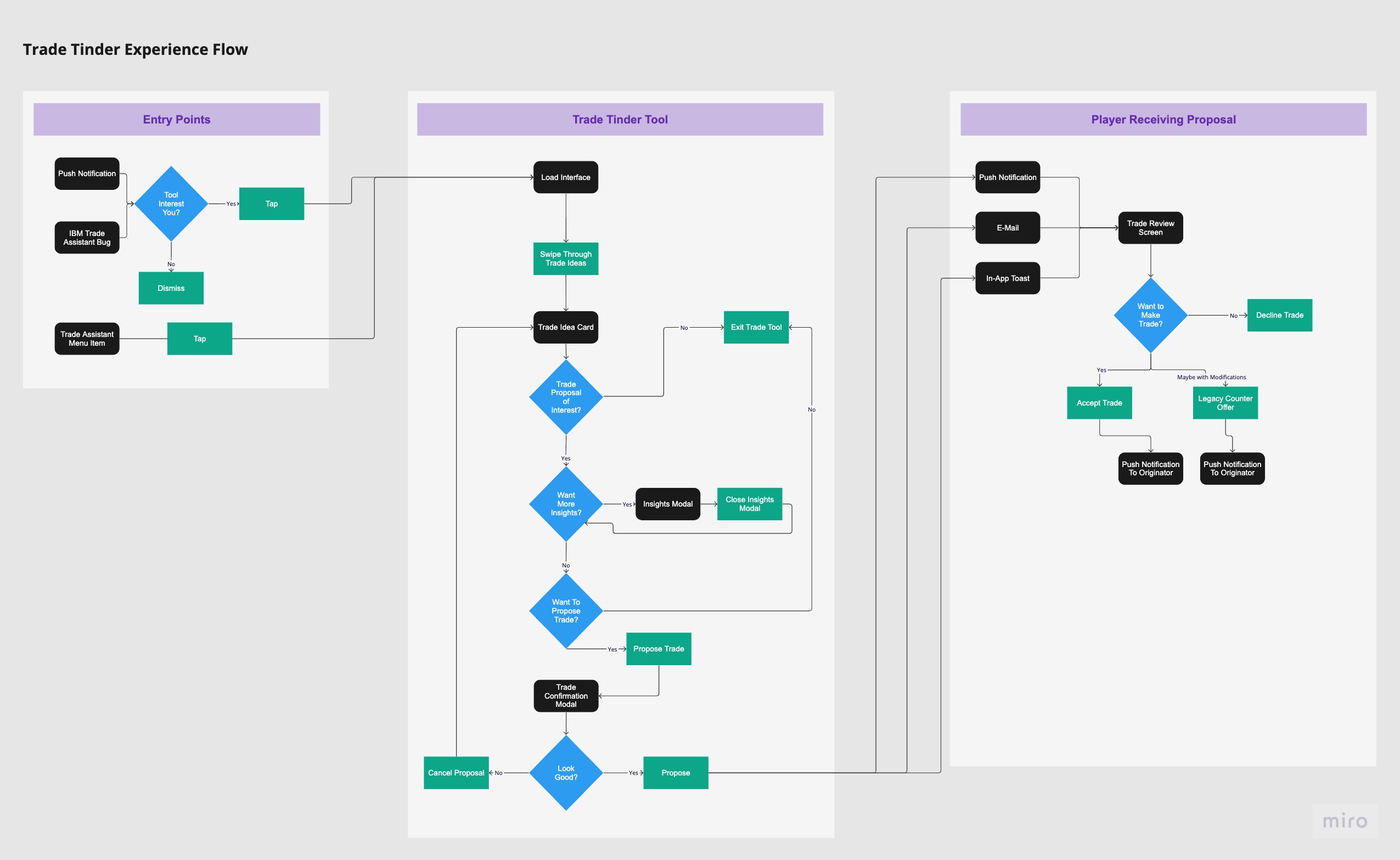
With this potential product being a self contained area of the app, and a layer on top of existing trade functionality, it was also important to create a flow diagram to understand where this product could sit within the Fantasy app on a technical level. This flow spanned from how we could introduce the tool to how a proposal would be received by another player. This helped visualize what would be new work, and what existing screens could be "hooked" into complete this flow.
A Fortuitous Opportunity
A few months later, one of ESPN's partners, IBM, who had been powering some next level insights on our player cards, wanted to expand upon our partnership in the upcoming Fantasy football season and apply their Watson computing power to another function with the app. This would entail a high dollar spend with ESPN, so stakes were pretty high from that standpoint.
Their product and marketing teams would be visiting campus to brainstorm ideas, and I suggested to the product team that “Trade Tinder” would be a great concept to present, and see if they could build the engine and algorithms behind it, with our team creating the user experience up front.
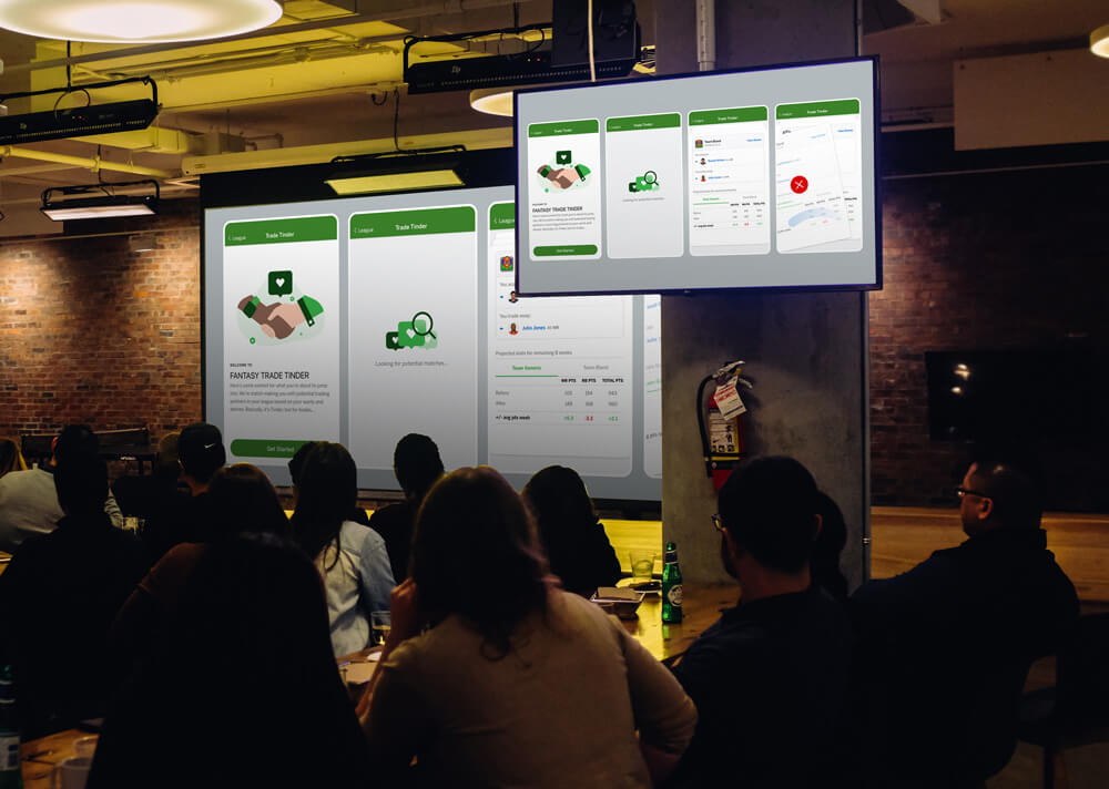
I presented the concept alongside my product and design team, and it was a hit! IBM agreed this was something they could power and showcase Watson. We used the remainder of the time with IBM discussing specifics and refining the concept further. They got to work on the back end in partnership with the ESPn engineering team, giving us time to test and iterate on the UX. From there, we collaborated formally on a weekly basis — sharing findings on the feasibility of IBM's data and the UX tweaks we needed on our end.
Research & Adjustments
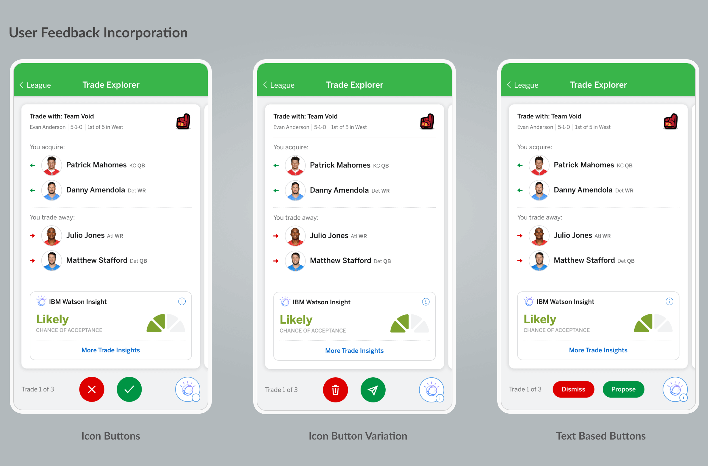
We wanted to quickly get some prototypes in front of users to get feedback on the concept and user experience. We received very positive feedback on the card concept and overall sentiment of the feature, but some trepidation and confusion about "swiping left" to dismiss and "swiping right" to accept a trade proposal. We were maybe leaning into the Tinder paradigm a bit too much given our older demographic and additional complexity of the task. Adding discrete action buttons to perform these functions tested better, and we iterated on those as you can see here. Ultimately buttons with text descriptions tested best. We also changed the working name of the feature to "Trade Explorer".
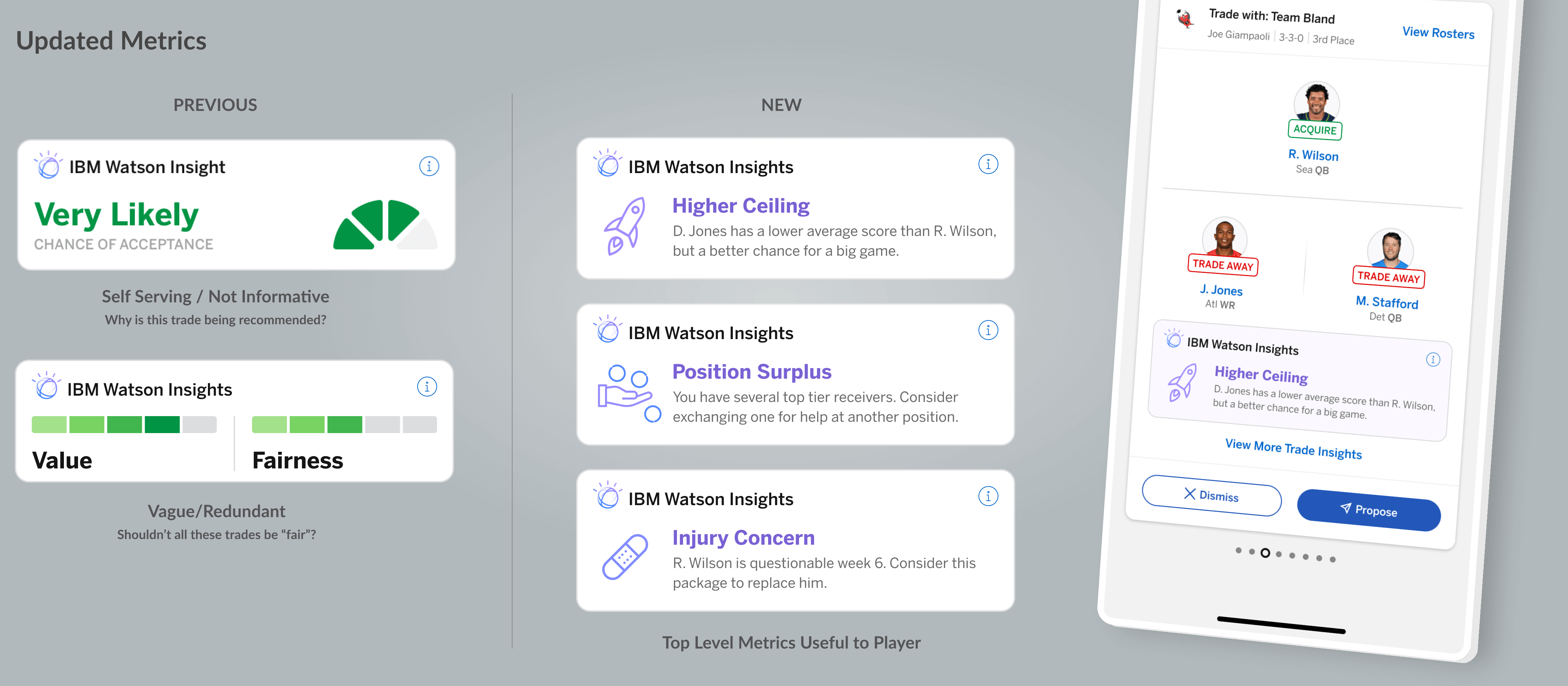
Something else we were working on with IBM is the bold, top level metric on each card. Given the tight timeframe, it proved a challenge to boil down the complexities of a trade to a single metric that would drive engagement. Ultimately what we were able to do is a "likelihood of acceptance" percentage based off various factors. I wasn't 100% invested in this metric as it's a bit self serving to our interests in order to get a trade proposal, but it was a compromise which we would improve upon in season two.
Diving Deeper
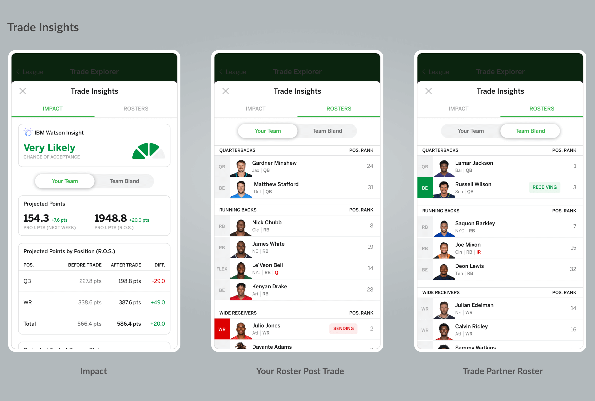
Along with the top level metric, we gave players the ability to dive deeper into the details of the trade and see how projected points would change with the trade, and what rosters would look like before and after, so they wouldnt have to leave the tool to perform this research. One of our tentpole missions for the Fantasy app was to provide enough content, research and tools that the player would not have to leave our app to find it.
Interactive Prototype
A clickable prototype was built to get better feedback from users on their understanding of the interactions and flow. The prototype was also valuable to share with engineering when the product was being built, so they were clear on the intention of the design.
Other tangible benefits of building the prototype was creating an increased excitement around the product for both stakeholders and members of the working team. There is nothing quite like seeing an interactive representation of a product.
We also used the prototype to share brand integrations with IBM. Earlier versions felt a little light on branding, but when they saw moving elements like the animated Watson logo when loading trades, they were pleased with the amount of branding we had built into the partnership.
Devices & Edge Cases - Getting The Details Right
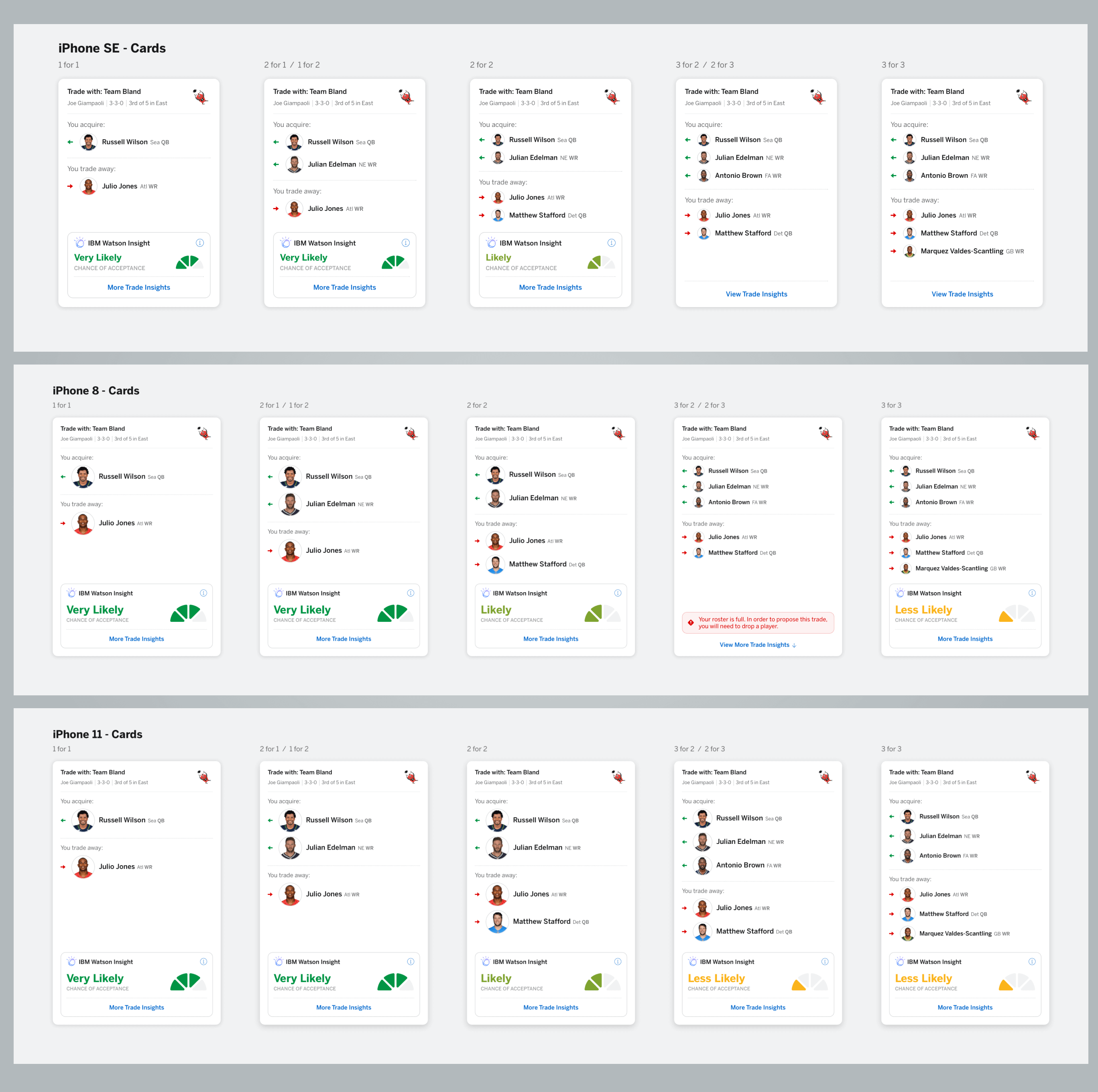
I pride myself on being very technical when it comes to design details and how we will implement solutions. When working on a feature like this which involves cards, and the desire to not have to vertically scroll to use, it was important to have the team mock the cards up on the different devices we support, and also with the different trade scenarios, such as one for two, or two for three trades to create a system that will fill the space efficiently.
Improving the Experience
Although quality trades proposed were way up in the first year of Trade Assistant, we felt there were more opportunities to increase adoption.
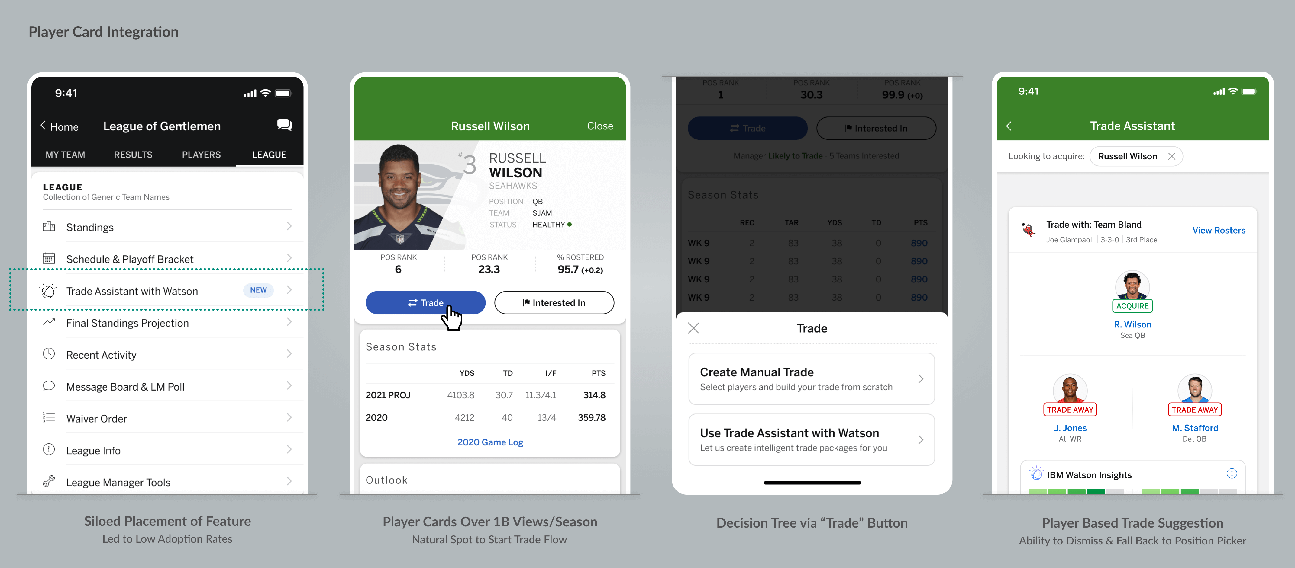
For the first year of Trade Assistant it only existed as an item within the league menu which gets a lot of traffic, but we have other pages which see a lot more eyeballs. The player cards within the app are one of the most visited pages across all of ESPN, garnering over 1 billion views per season. It is a natural place for th euser to evaluate a player's performance and then decide if they want to trade them.
We worked with IBM to have the trade assistant flow start with a specified player you want to trade, and we created a decision tree when clicking the trade button, to either proceed with building a trade manually, or have Trade Assistant package fair trades involving that player.
Inceased Usage & Acceptance Rates
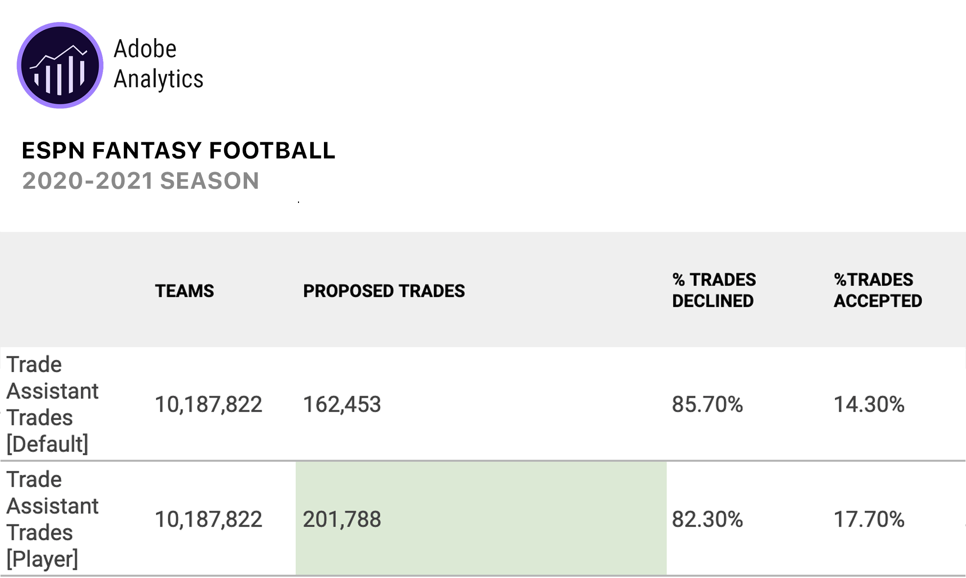
This increased both the number of trades proposed with the tool and the acceptance rates as illustrated in the metrics here. In addition to the player specific trade path, we also introduced POSITION specific trading options as seen below. When coming into the tool, the player could choose which positions they want to improve, and only get suggestions to address those.

Being Less Self-Serving
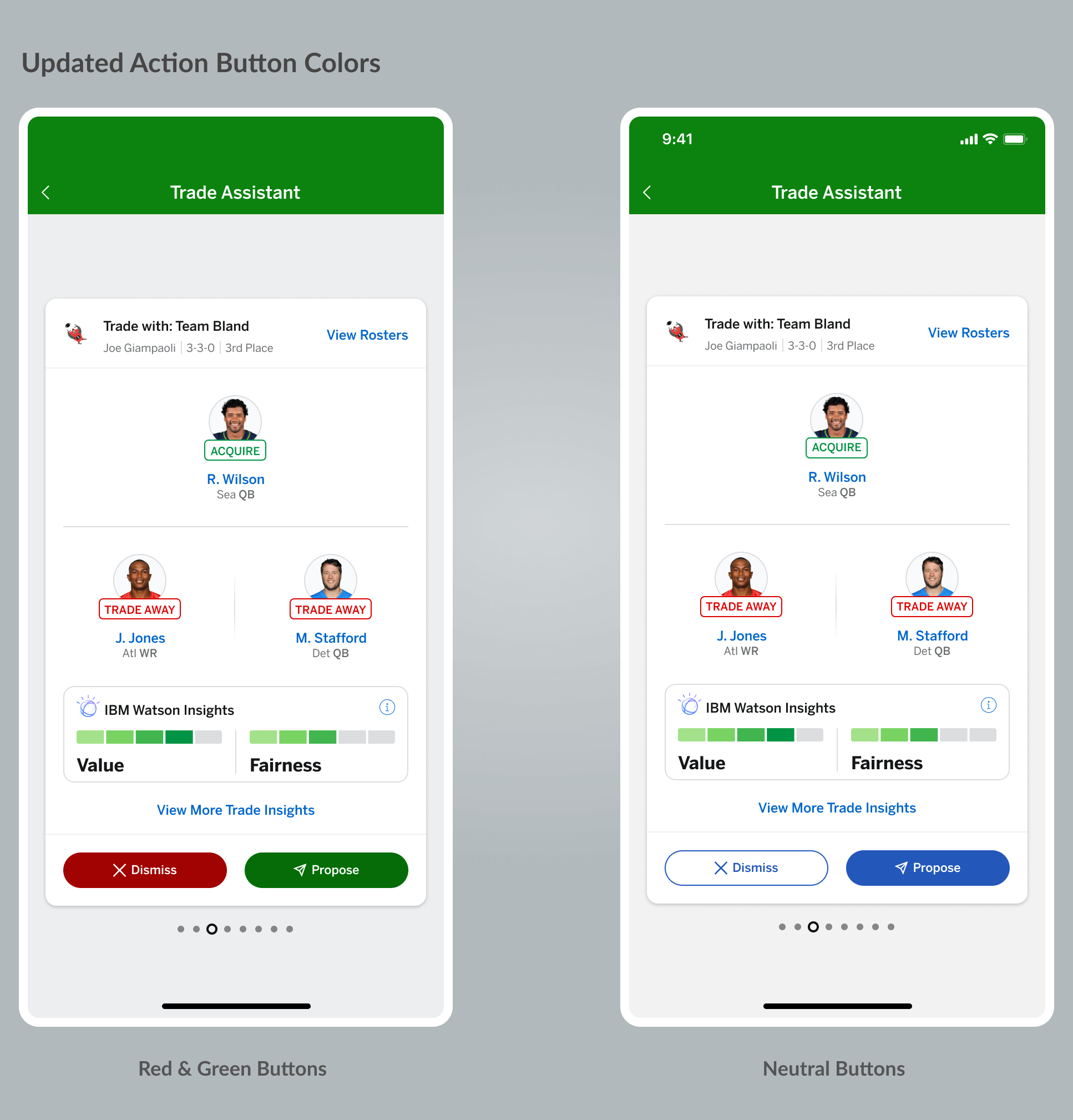
Based on player feedback, another small, but important change we made for season two, was to not use our red destructive color for the "Dismiss" button, and our green positive color for the "Propose" button. This tool is meant to suggest trade ideas and let the player assess the data to decide if it makes sense for them. Using the red and green indicated they were doing something negative if they didn't propose the trade. Instead we changed the button colors to our standard blue, fill and stroked buttons.
Better Top Level Metrics
As I mentioned earlier, we were not 100% pleased with the top level "likelihood of acceptance" metric we launched with for season one. This was something we iterated on and tested for season two. Fans indicated they wanted something more tangible and easier to understand. We worked with IBM to identify the top reasons trades were being proposed and expose them on the card. Users reacted positively to these metrics and felt it was a much better starting point for the player to make a quick assessment and dive deeper into the research if necessary.
Business Outcomes
- $6MM revenue from IBM sponsorship.
- Increased trades and time spent metric.
- Differentiating feature from competition.
- Stride towards goal of expending our demographics and functionality for newer players.
People Outcomes
- Junior designer created concept and presented to IBM
- Established great working relationship and solidified partnership with IBM.
- Design team played big role in user testing.
- Other design team members played key role in feedback sessions.